Table of Contents
1 Read in the concentration dataset
2 Get a feeling for the range of concentrations
3 Create a normalized pallette
4 plot the grid
Plotting fields using pcolormesh
Matplotlib has a couple of different ways of plotting 2-dimensional fields. For problems typical of our class, contourf is usually not what we want, because it does its own interpolation on the gridcells. If you don’t want that smearing, then use pcolor or pcolormesh. The p stands for “pseudo” (because concentrations don’t really have colors, and the “mesh” indicates that the routine is laying down a cellular mesh to plot into).
Below I show how to use pcolormesh plus fancy pallette features to plot limited ranges of data.
[1]:
import matplotlib
import matplotlib.pyplot as plt
import numpy as np
import context
setting context.data_dir to /Users/phil/repos/eosc213_students/notebooks/cookbook_examples
Read in the concentration dataset
[2]:
cp = np.load(context.data_dir / "colormap_data.npz")
x, y, c = cp["x"], cp["y"], cp["c"]
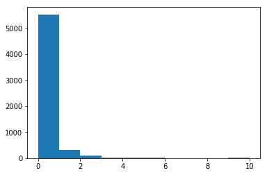
Get a feeling for the range of concentrations
[3]:
plt.hist(c.flat)
[3]:
(array([5.528e+03, 3.080e+02, 1.000e+02, 2.000e+01, 1.200e+01, 1.200e+01,
        0.000e+00, 4.000e+00, 0.000e+00, 1.600e+01]),
 array([ 0.,  1.,  2.,  3.,  4.,  5.,  6.,  7.,  8.,  9., 10.]),
 <a list of 10 Patch objects>)
Create a normalized pallette
The next cell allows me to focus on the concentration values between 0.2 and 1.5. It does this by assigning all the 256 pallette colors values in that range. If a concentration is larger than 1.5 it gets colored white, and if a color is less than 0. it gets colored teal. If the data is missing, it is colored light gray (i.e. 0.75 as bright as white)
“xkcd” below is a reference to the xkcd color names which are explained (in pretty interesting) detail here
[4]:
pal = plt.get_cmap("RdYlBu").reversed()
pal.set_bad("0.75")  # 75% grey for np.nan (missing data)
pal.set_over("xkcd:white")  # color cells > vmax white
pal.set_under("xkcd:teal")  # color cells < vmin teal
vmax = 1.5
vmin = 0.2
the_norm = matplotlib.colors.Normalize(vmin=vmin, vmax=vmax, clip=False)
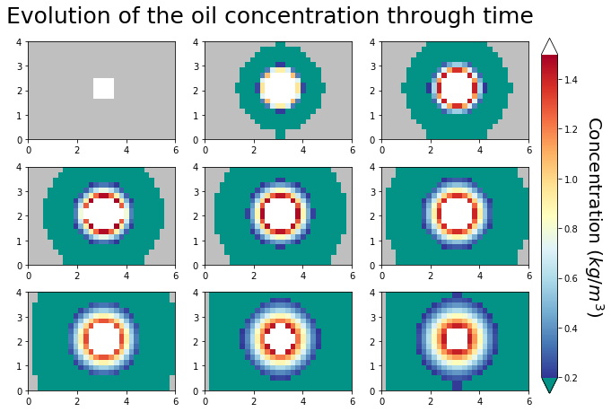
plot the grid
I had trouble putting a fancy pallette on the axes_grid1 layout we were using, so I went back to basics and placed the colorbar by hand. Things to note:
I needed to set the aspect ratio to 1 to preserve the rectangular shape. If you comment out the_ax.set_aspect(1) below you’ll get square axes, which is not what we want.
I set concentrations smaller than 1.e-4 to missing/np.nan, so they get their own color initially and it is clear that the spot is diffusing into clean water.
I create axes number 10 to hold the colorbar by specifying x,y coordinates for the lower corner as 0.92,0.1 a width of 0.025 and and height of 0.55. This was pure trial and error.
[6]:
plot_c = np.array(c)
plot_c[plot_c < 1.0e-4] = np.nan
m2km = 1.0e-3
time_steps = np.array([0, 1, 2, 3, 4, 5, 6, 7, 8])
nfig = len(time_steps)
fig, grid = plt.subplots(3, 3, figsize=(10, 10))
ntimesteps = len(time_steps)

for time_index, the_ax in zip(time_steps, grid.flat):
    im = the_ax.pcolormesh(
        x * m2km, y * m2km, plot_c[:, :, time_index], norm=the_norm, cmap=pal
    )
    the_ax.set_aspect(1)
    fig.subplots_adjust(bottom=0.1, top=0.65)

cax = fig.add_axes([0.92, 0.1, 0.025, 0.55], frameon=False)
cbar = matplotlib.colorbar.Colorbar(cax, im, extend="both")
cbar.ax.set_ylabel("Concentration ($kg/m^3$)", rotation=270, size=20, va="bottom")
fig.suptitle(
    "Evolution of the oil concentration through time", y=0.7, size=25, va="top"
);