7.6. Bar Charts and Pie Charts
Bar charts and pie charts can be created with Matplotlib’s pyplot library.
7.6.1. Bar Charts
To construct a bar plot using Matplotlib, first import Matplotlib’s pyplot library. The alias plt is commonly used to substitute matplotlib.pyplot. If using a Jupiter notebook, include the line %matplotlib inline. In the next example, NumPy is used. So NumPy must be included in the imports as well as Matplotlib.
import numpy as np
import matplotlib.pyplot as plt
# if using a Jupyter notebook, include:
%matplotlib inline
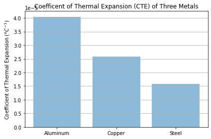
We need some data to add to our bar chart. In this case, the data is from a set of coefficient of thermal expansion lab measurements. The coefficient of thermal expansion (CTE) is a material property that describes how much a material will change in length as a result of a change in temperature. Different materials have different CTE’s and we can use the lab data to determine which material will expand the most if all three materials are heated up to the same temperature (assuming all three materials start at the same temperature).
First, we need to input the lab measurement data as NumPy arrays:
# Data
aluminum = np.array([
    6.4e-5, 3.01e-5, 2.36e-5, 3.0e-5, 7.0e-5, 4.5e-5, 3.8e-5, 4.2e-5, 2.62e-5,
    3.6e-5
])
copper = np.array([
    4.5e-5, 1.97e-5, 1.6e-5, 1.97e-5, 4.0e-5, 2.4e-5, 1.9e-5, 2.41e-5, 1.85e-5,
    3.3e-5
])
steel = np.array([
    3.3e-5, 1.2e-5, 0.9e-5, 1.2e-5, 1.3e-5, 1.6e-5, 1.4e-5, 1.58e-5, 1.32e-5,
    2.1e-5
])
Next, calculate the average or mean of each data set using NumPy’s np.mean() function.
# Calculate the average
aluminum_mean = np.mean(aluminum)
copper_mean = np.mean(copper)
steel_mean = np.mean(steel)
Then build a list of materials and CTE’s. Note the list of materials is a list of strings, the list of x-positions x_pos is an array of numbers [0,1,2], and the list CTEs is a list of three numbers from the np.mean() calculation above. Python’s len() function returns the length of a list, array, dictionary or tuple.
# Create arrays for the plot
materials = ['Aluminum', 'Copper', 'Steel']
x_pos = np.arange(len(materials))
CTEs = [aluminum_mean, copper_mean, steel_mean]
After the materials, x_pos, and CTEs (the labels below the bars) are defined, the bar chart is created using the ax.bar() method.
Mathplotlib’s ax.bar() method requires two positional arguments, a list of bar positions and a list of bar heights. In this bar chart, x_pos is the list of bar positions and CTEs is the list of bar heights.
The list of materials is passed to the ax.set_xticklabels() method.
# Build the plot
fig, ax = plt.subplots()

ax.bar(x_pos, CTEs, align='center', alpha=0.5)
ax.set_ylabel('Coefficient of Thermal Expansion ($\degree C^{-1}$)')
ax.set_xticks(x_pos)
ax.set_xticklabels(materials)
ax.set_title('Coefficent of Thermal Expansion (CTE) of Three Metals')
ax.yaxis.grid(True)

# Save the figure and show
plt.tight_layout()
plt.savefig('bar_plot.png')
plt.show()

7.6.2. Pie Charts
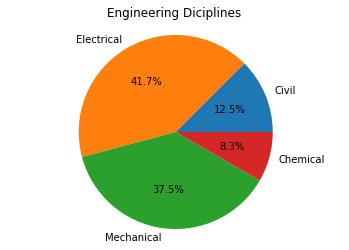
Pie charts can be constructed with Matplotlib’s ax.pie() method. The one required positional argument supplied to the ax.pie() method is a list of pie piece sizes. Optional keyword arguments include a list of pie piece labels (label= ) and if the percentages will be auto-calculated and in what format (autopct= ).
For our first pie chart, the data we will plot describes the number of students who choose different engineering majors at colleges in the US each year.
The following table lists the approximate numbers of engineering graduates in different engineering disciplines:
Discipline |
Number of graduates |
|---|---|
Civil Engineering |
15,000 graduates |
Electrical Engineering |
50,000 graduates |
Mechanical Engineering |
45,000 graduates |
Chemical Engineering |
10,000 graduates |
We will plot this data on a pie chart with Matplotlib’s ax.pie() method. The pie piece labels are defined as a list of strings, and the pie piece sizes are defined as a list of integers. The line ax.axis('equal') is needed to ensure the pie chart is a circle. If you leave out ax.axis('equal'), the pie chart may look like an oval instead of a circle.
The code section below builds a pie chart with four pie pieces, each pie piece labeled with a relative size auto-calculated to the nearest 10th of a percent.
import numpy as np
import matplotlib.pyplot as plt
# if using a Jupyter notebook, include:
%matplotlib inline

# Pie chart, where the slices will be ordered and plotted counter-clockwise:
labels = ['Civil', 'Electrical', 'Mechanical', 'Chemical']
sizes = [15, 50, 45, 10]

fig, ax = plt.subplots()
ax.pie(sizes, labels=labels, autopct='%1.1f%%')
ax.axis('equal')  # Equal aspect ratio ensures the pie chart is circular.
ax.set_title('Engineering Diciplines')

plt.show()

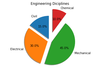
Pie pieces can be highlighted by “exploding” them out. Exploded pie pieces are applied to a Matplotlib pie chart by supplying the explode= keyword argument to the ax.pie() method. shadow=True and startangle= are two additional keyword arguments that can be passed to the ax.pie() method to control the angle and rotation of the pieces on a pie chart.
The code section below creates a pie chart with the pie pieces separated and the “Chemical” piece exploded out.
import numpy as np
import matplotlib.pyplot as plt
# if using a Jupyter notebook, include:
%matplotlib inline

# Pie chart, where the slices will be ordered and plotted counter-clockwise
labels = ['Civil', 'Electrical', 'Mechanical', 'Chemical']
sizes = [15, 30, 45, 10]

# Explode out the 'Chemical' pie piece by offsetting it a greater amount
explode = (0.1, 0.1, 0.1, 0.4)
fig, ax = plt.subplots()
ax.pie(sizes,
       explode=explode,
       labels=labels,
       autopct='%1.1f%%',
       shadow=True,
       startangle=90)
ax.axis('equal')  # Equal aspect ratio ensures the pie chart is circular.
ax.set_title('Engineering Diciplines')

plt.show()
