7.3. Line Plots
Line plots can be created in Python with Matplotlib’s pyplot library.
To build a line plot, first import Matplotlib. It is a standard convention to import Matplotlib’s pyplot library as plt. The plt alias will be familiar to other Python programmers.
If using a Jupyter notebook, include the line %matplotlib inline after the imports. %matplotlib inline is a Jupyter notebook magic command which causes Matplotlib plots to display directly inside Jupyter notebook output cells.
To build our first plot, we will also use NumPy, a numerical computing library for Python. NumPy is typically imported with the alias np.
import matplotlib.pyplot as plt
import numpy as np
# if using a Jupyter notebook, include:
%matplotlib inline
NumPy’s np.arange() function creates an array of numbers with the parameters np.arange(start,stop,step). NumPy’s np.sin() and np.pi functions do what you expect, calculate the sine of an array and compute \(\pi\). We use these functions to create two arrays of numbers x and y.
x = np.arange(0, 4 * np.pi, 0.1)
y = np.sin(x)
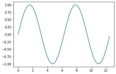
To create a line plot, pass an array or list of numbers as an argument to Matplotlib’s plt.plot() function. The command plt.show() is needed at the end to show the plot. Make sure to include the double parenthesis () in plt.show().
plt.plot(x, y)
plt.show()

The result is a line plot that shows sin(x) from 0 to 4\(\pi\).
7.3.1. Features of a Matplotlib plot
A variety of features on a Matplotlib plot can be specified. The following is a list of commonly defined features:
7.3.1.1. Line Color, Line Width, Line Style, Line Opacity and Marker Options
The color, width, and style of line in a Matplotlib plot can be specified. Line color, line width, and line style are included as extra keyword arguments in the plt.plot() function call.
plt.plot(<x-data>,<y-data>,
            linewideth=<float or int>,
            linestyle='<linestyle abbreviation>',
            color='<color abbreviation>',
            marker='<marker abbreviation>')
An example plt.plot() function call including line color, line width, and line style options is:
plt.plot(x, y,
         linewidth=2.0,
         linestyle='+',
         color='b',
         alpha=0.5,
         marker='o')
Below is a list of linewidths (many other widths are also available).
|
Line Width |
|---|---|
0.5 |
0.5 pixels wide |
1 |
1 pixel wide |
1.5 |
1.5 pixels wide |
2 |
2 pixels wide |
3 |
3 pixels wide |
Below is a list of line styles.
|
Line Style |
|---|---|
|
solid line (default) |
|
dashed line |
|
dash-dot line |
|
dotted line |
|
no line |
Below is a list of color abbreviations. Note 'b' is used for blue and 'k' is used for black.
|
Color Name |
|---|---|
|
blue |
|
cyan |
|
green |
|
black |
|
magenta |
|
red |
|
white |
|
yellow |
Colors can also be specified in hexadecimal form surrounded by quotation marks like '#FF69B4' or in RGBA (red, green, blue, opacity) color surrounded by parenthesis like (255,182,193,0.5).
|
Color Format |
|---|---|
|
hexadecimal |
|
RGBA |
Below is a list of alpha (opacity) values (any alpha value between 0.0 and 1.0 is possible).
|
Opacity |
|---|---|
|
transparent |
|
half transparent |
|
opaque |
Below is a list of maker styles.
|
Marker Style |
|---|---|
|
point |
|
one pixel |
|
circle |
|
triangle_down |
|
triangle_up |
|
octagon |
|
square |
|
pentagon |
|
star |
|
hexagon 1 |
|
hexagon 2 |
|
plus |
|
filled plus |
|
x |
|
filled x |
|
diamond |
|
thin diamond |
In addition to marker='<marker style>', the color of the marker edge, the color of the marker face and the size of the marker can be specified with:
plt.plot( ....
         markeredgecolor='<color abbreviation>',
         markerfacecolor='<color abbreviation>',
         markersize=<float or int>
         ....)
7.3.1.2. Title
The plot title will be shown above the plot. The plt.title() command accepts a string as an argument.
plt.title('My Plot Title')
7.3.1.3. x-axis label
The x-axis label is shown below the x-axis. The plt.xlabel() command accepts a string as an argument.
plt.xlabel('My x-axis label')
7.3.1.4. y-axis label
The y-axis label is shown to the left of the y-axis. The plt.ylabel() command also accepts a string as an argument.
plt.ylabel('My y-axis label')
7.3.1.5. Legend
You can use the plt.legend() command to insert a legend on a plot. The legend appears within the plot area, in the upper right corner by default. The plt.legend() command accepts a list of strings and optionally accepts a loc= argument to specify the legend location.
plt.legend(['entry1','entry2'], loc = 0)
The following are the legend location codes. These numbers need to be placed after loc= in the plt.legend() call.
Legend Location |
|
|---|---|
‘best’ |
|
‘upper right’ |
|
‘upper left’ |
|
‘lower left’ |
|
‘lower right’ |
|
‘right’ |
|
‘center left’ |
|
‘center right’ |
|
‘lower center’ |
|
‘upper center’ |
|
‘center’ |
|
7.3.1.6. Grid
A grid can be added to a Matplotlib plot using the plt.grid() command. By defaut, the grid is turned off. To turn on the grid use:
plt.grid(True)
The only valid options are plt.grid(True) and plt.grid(False). Note that True and False are capitalized and are not enclosed in quotes.
7.3.1.7. Tick Labels
Tick labels can be specified on a Matplotlib plot using plt.xticks() and plt.yticks(). To add tick labels use:
plt.xticks([locations list],[labels list])
plt.yticks([locations list],[labels list])
The [locations list] can be a Python list or NumPy array of tick locations . The [labels list] is a Python list or NumPy array of strings.
7.3.2. Build a plot in five steps
The steps below show a logical progression to build a plot with Matplotlib:
Imports
Define data
Plot data including options
Add plot details
Show the plot
Details of each step is explained below.
7.3.2.1. 1. Imports
Import matplot.pyplot as plt, as well as any other modules needed to work with the data such as NumPy or Pandas. If using a Jupyter notebook, include the line %matplotlib inline in the import section.
7.3.2.2. 2. Define data
The plot needs to contain data. Data is defined after the imports. Typically, data for plots is contained in Python lists, NumPy arrays or Pandas dataframes.
7.3.2.3. 3. Plot data including options
Use plt.plot() to plot the data you defined. Note the plt.plot() line needs to be called before any other plot details are specified. Otherwise, the details have no plot to apply to.
Besides data, the plt.plot() function can include keyword arguments such as:
linewideth= <float or int>linestyle='<linestyle abbreviation>'color='<color abbreviation>'alpha= <float or int>marker='<marker abbreviation>'markeredgecolor='<color abbreviation>'markerfacecolor='<color abbreviation>'markersize=<float or int>
7.3.2.4. 4. Add plot details
After the plt.plot() line, add details such as a title, axis labels, legend, grid, and tick labels. Plot details to add include:
plt.title('<title string>')plt.xlabel('<x-axis label string>')plt.ylabel('<y-axis label string>')plt.legend(['list','of','strings'])ptl.grid(<True or False>)plt.xticks([locations list or array], [labels list])plt.yticks([locations list or array], [labels list])
7.3.2.5. 5. Show the plot
Use the plt.show() command to show the plot. plt.show() causes the plot to display in a Jupyter notebook or pop out in a new window if the plot is constructed in a separate .py file. Note that plt.show() needs to be called after plt.plot() and any plot details such as plt.title().
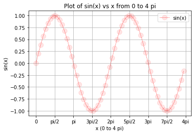
The next code section utilizes the 5 steps to build a plot. The resulting plot is shown after the code.
# 1. Imports
import numpy as np
import matplotlib.pyplot as plt
# if using a Jupyter notebook, include:
%matplotlib inline

# 2. Define data
x = np.arange(0, 4 * np.pi, 0.2)
y = np.sin(x)

# 3. Plot data including options
plt.plot(x, y,
    linewidth=0.5,
    linestyle='--',
    color='r',
    marker='o',
    markersize=10,
    markerfacecolor=(1, 0, 0, 0.1))

# 4. Add plot details
plt.title('Plot of sin(x) vs x from 0 to 4 pi')
plt.xlabel('x (0 to 4 pi)')
plt.ylabel('sin(x)')
plt.legend(['sin(x)']) # list containing one string
plt.xticks(
    np.arange(0, 4*np.pi + np.pi/2, np.pi/2),
    ['0','pi/2','pi','3pi/2','2pi','5pi/2','3pi','7pi/2','4pi'])
plt.grid(True)

# 5. Show the plot
plt.show()
