7.8. Histograms
Histograms are a useful type of statistics plot for problem solvers. A histogram is a type of bar plot that shows the frequency or number of values compared to a set of value ranges. Matplotlib’s ax.hist() function creates histogram plots.
In this example, we’ll use NumPy’s np.random.normal() function to create an array of random numbers with a normal distribution. The three arguments passed to NumPy’s np.random.normal() function are mu (mean), sigma (standard deviation) and size= (length of the array).
Matplotlib’s ax.hist() method is used to build the histogram. The first argument passed to ax.hist() corresponds to the list or array of values to plot. The second argument corresponds to the number of bins, or number of bars on the histogram. The general format of Matplotlib’s ax.hist() method is below.
ax.hist(data, num_bins)
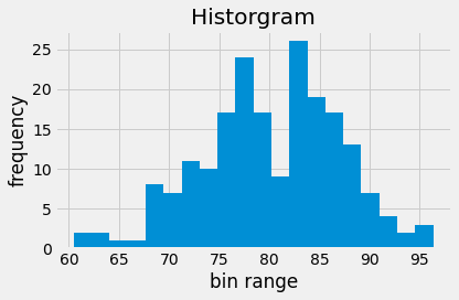
In this example, we’ll specify 20 bins (20 bars).
The line plt.style.use('fivethirtyeight') is included to style the plot to look like plots on fivethirtyeight.com. Matplotlib styles are addressed in a subsequent section of this chapter.
The code section below builds a histogram that contains 20 bins.
import numpy as np
import matplotlib.pyplot as plt
# if using a Jupyter notebook, include:
%matplotlib inline
plt.style.use('fivethirtyeight')

mu = 80
sigma = 7
x = np.random.normal(mu, sigma, size=200)

fig, ax = plt.subplots()

ax.hist(x, 20)
ax.set_title('Historgram')
ax.set_xlabel('bin range')
ax.set_ylabel('frequency')

fig.tight_layout()
plt.show()

The resulting histogram has 20 bars and shows a roughly normal distribution.