7.9. Box Plots and Violin Plots
In addition to histograms, a couple other useful statistical plots are box plots and violin plots.
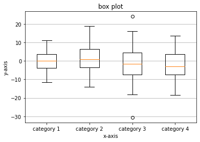
7.9.1. Box Plots
To create a box plot with Matplotlib, the ax.boxplot() method is used. The general syntax is:
ax.boxplot(data)
The data passed to the ax.boxplot() method can be a Python list or NumPy array. To create multiple box plots side by side, pass in a list of lists or a 2D NumPy array.
The code section below creates a box plot with four elements.
import numpy as np
import matplotlib.pyplot as plt
# if using a Jupyter notebook, include:
%matplotlib inline

# generate some random data
data1 = np.random.normal(0, 6, 100)
data2 = np.random.normal(0, 7, 100)
data3 = np.random.normal(0, 8, 100)
data4 = np.random.normal(0, 9, 100)
data = list([data1, data2, data3, data4])

fig, ax = plt.subplots()

# build a box plot
ax.boxplot(data)

# title and axis labels
ax.set_title('box plot')
ax.set_xlabel('x-axis')
ax.set_ylabel('y-axis')
xticklabels=['category 1', 'category 2', 'category 3', 'category 4']
ax.set_xticklabels(xticklabels)

# add horizontal grid lines
ax.yaxis.grid(True)

# show the plot
plt.show()
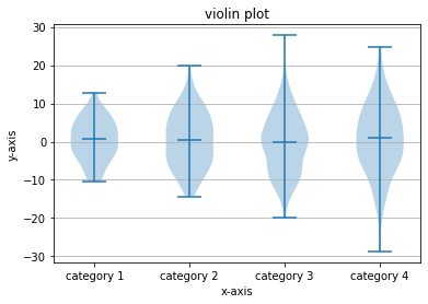
7.9.2. Violin Plots
Violin plots are another type of statistical plot. A violin plot is similar to a box plot, but a violin plot shows some additional information. The sides of the “violins” in a violin plot corresponds to a kernel density estimation (kind of like a histogram) flipped vertically.
To create a violin plot with Matplotlib, use the ax.violinplot() method. The general syntax is:
ax.violinplot(data)
A couple of extra keyword arguments that can be included are showmeans= and showmedians= .
ax.violinplot(data, showmeans=True, showmedians=False)
The following code section builds a violin plot with 4 “violins” using randomly generated data.
import numpy as np
import matplotlib.pyplot as plt
# if using a Jupyter notebook, include:
%matplotlib inline

# generate some random data
data1 = np.random.normal(0, 6, 100)
data2 = np.random.normal(0, 7, 100)
data3 = np.random.normal(0, 8, 100)
data4 = np.random.normal(0, 9, 100)
data = list([data1, data2, data3, data4])

fig, ax = plt.subplots()

# build a violin plot
ax.violinplot(data, showmeans=False, showmedians=True)

# add title and axis labels
ax.set_title('violin plot')
ax.set_xlabel('x-axis')
ax.set_ylabel('y-axis')

# add x-tick labels
xticklabels = ['category 1', 'category 2', 'category 3', 'category 4']
ax.set_xticks([1,2,3,4])
ax.set_xticklabels(xticklabels)

# add horizontal grid lines
ax.yaxis.grid(True)

# show the plot
plt.show()