7.7. Error Bars
Matplotlib line plots and bar charts can include error bars. Error bars are useful to problem solvers because error bars show the confidence or precision in a set of measurements or calculated values. Bar charts without error bars give the illusion that a measured or calculated value is known to high precision or high confidence.
7.7.1. Error bars in bar plots
To construct a bar plot with error bars, first import Matplotlib. If using a Jupyter notebook, include the line %matplotlib inline
import numpy as np
import matplotlib.pyplot as plt
# include if using a Jupyter notebook
%matplotlib inline
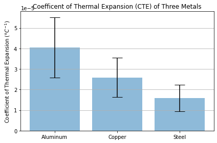
We’ll apply error bars to the Coefficient of Thermal Expansion data used in a previous section. First the data is stored in three NumPy arrays. Then the mean or average of each array is calculated. The mean of each array will be the height of the bars in the bar plot. Next, the standard deviation of each array is calculated. The standard deviation will be the height of the error bars. Finally, a couple lists are created that correspond to the bar labels (labels), bar positions (x_pos), bar heights (CTEs), and the error bar heights (error).
# Data
aluminum = np.array([6.4e-5 , 3.01e-5 , 2.36e-5, 3.0e-5, 7.0e-5, 4.5e-5, 3.8e-5,
                     4.2e-5, 2.62e-5, 3.6e-5])
copper = np.array([4.5e-5 , 1.97e-5 , 1.6e-5, 1.97e-5, 4.0e-5, 2.4e-5, 1.9e-5,
                   2.41e-5 , 1.85e-5, 3.3e-5 ])
steel = np.array([3.3e-5 , 1.2e-5 , 0.9e-5, 1.2e-5, 1.3e-5, 1.6e-5, 1.4e-5,
                  1.58e-5, 1.32e-5 , 2.1e-5])

# Calculate the average
aluminum_mean = np.mean(aluminum)
copper_mean = np.mean(copper)
steel_mean = np.mean(steel)

# Calculate the standard deviation
aluminum_std = np.std(aluminum)
copper_std = np.std(copper)
steel_std = np.std(steel)

# Define labels, positions, bar heights and error bar heights
labels = ['Aluminum', 'Copper', 'Steel']
x_pos = np.arange(len(labels))
CTEs = [aluminum_mean, copper_mean, steel_mean]
error = [aluminum_std, copper_std, steel_std]
# Build the plot
fig, ax = plt.subplots()
ax.bar(x_pos, CTEs,
       yerr=error,
       align='center',
       alpha=0.5,
       ecolor='black',
       capsize=10)
ax.set_ylabel('Coefficient of Thermal Expansion ($\degree C^{-1}$)')
ax.set_xticks(x_pos)
ax.set_xticklabels(labels)
ax.set_title('Coefficent of Thermal Expansion (CTE) of Three Metals')
ax.yaxis.grid(True)

# Save the figure and show
plt.tight_layout()
plt.savefig('bar_plot_with_error_bars.png')
plt.show()

The resulting plot contains three error bars. We can see the standard deviation of the aluminum data is greater than the standard deviation of the steel by looking at the error by lengths.
7.7.2. Error bars in line plots
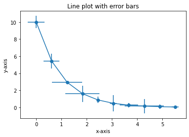
Error bars can also be added to line plots created with Matplotlib. The ax.errorbar() method is used to create a line plot with error bars. The two positional arguments supplied to ax.errorbar() are the lists or arrays of x, y data points. The two keyword arguments xerr= and yerr= define the error bar lengths in the x and y directions.
The general format of Matplotlib’s ax.errorbar() method is below:
ax.errorbar(x, y,
            xerr=<error bar width>
            yerr=<error bar height>
            fmt=<format>)
The following code section builds a line plot with horizontal and vertical error bars included on each point in the plot. The error bar widths and heights are created using NumPy’s random_sample function.
import numpy as np
import matplotlib.pyplot as plt
# if using a Jupyter notebook, include:
%matplotlib inline

x = np.linspace(0,5.5,10)
y = 10*np.exp(-x)
xerr = np.random.random_sample(10)
yerr = np.random.random_sample(10)

fig, ax = plt.subplots()

ax.errorbar(x, y,
            xerr=xerr,
            yerr=yerr,
            fmt='-o')

ax.set_xlabel('x-axis')
ax.set_ylabel('y-axis')
ax.set_title('Line plot with error bars')

plt.show()
