7.14. Contour Plots
Contour plots can be created with Matplotlib. In Civil Engineering a contour plot could show the topology of a building sight. In Mechanical Engineering a contour plot could show the stress gradient across part surface.
7.14.1. Matplotlib’s plt.contourf() method
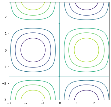
Building contour plots with Matplotlib entails using the ax.contour() method. The basic ax.contour() method call is below.
ax.contour(X, Y, Z)
Where X and Y are 2D arrays of the x and y points, and Z is a 2D array of points that determines the “height” of the contour, which is represented by color in a 2D plot.
The code section below includes NumPy’s np.meshgrid() function which produces two 2D arrays from two 1D arrays.
import numpy as np
import matplotlib.pyplot as plt
# if using a Jupyter notebook, include:
%matplotlib inline

x = np.arange(-3.0, 3.0, 0.1)
y = np.arange(-3.0, 3.0, 0.1)
X, Y = np.meshgrid(x, y)

Z = np.sin(X)*np.cos(Y)

fig, ax = plt.subplots(figsize=(6,6))

ax.contour(X,Y,Z)

plt.show()

7.14.2. Matplotlib’s plt.contourf() method
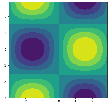
Matplotlib’s ax.contourf() method is similar to ax.contour() except that ax.contourf() produces contour plots that are “filled”. Instead of lines in a ax.contour() plot, shaded areas are produced by a ax.contourf() plot. The general method call for ax.contourf() is similar to ax.contour().
ax.contourf(X, Y, Z)
Where X and Y are 2D arrays of the x and y points, and Z is a 2D array of points that determines the color of the areas on the 2D plot.
The next code section builds a shaded contour plotting using Matplotlib’s ax.contourf() method.
import numpy as np
import matplotlib.pyplot as plt
# if using a Jupyter notebook, include:
%matplotlib inline

x = np.arange(-3.0, 3.0, 0.1)
y = np.arange(-3.0, 3.0, 0.1)

X, Y = np.meshgrid(x, y)

Z = np.sin(X)*np.cos(Y)

fig, ax = plt.subplots(figsize=(6,6))

ax.contourf(X,Y,Z)

plt.show()

7.14.3. Color bars on contour plots
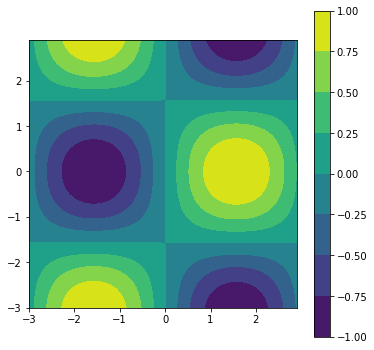
Because colors represent a third dimension (like “hight”) on a 2D plot, it is useful to have a scale to what each color means. A color scale is typically represented besides a plot.
Color bars are added to Matplotlib contour plots using the fig.colorbar() method. Since the color bar is not part of the contour plot, the color bar needs to be applied to the figure object, often called fig. A contour plot needs to be passed into the fig.colorbar() method. Therefore, when you add a color bar to a figure, a plot object needs to be available. A plot object is the output of the ax.contourf() method.
Previously, the output of the ax.contourf() method was not assigned to a variable. But to include a color bar on a contour plot, the plot object needs to be saved to a variable, so that the plot object can be passed to the fig.colorbar() method.
cf = ax.contourf(X,Y,Z)
fig.colorbar(cf, ax=ax)
Where cf is the plot object created by ax.contourf(X, Y, Z). The axis object that contains the contour plot, ax is passed to the fig.colorbar() method along with the cf plot object.
The code section below creates a filled contour plot with a color bar placed beside the plot.
import numpy as np
import matplotlib.pyplot as plt
# if using a Jupyter notebook, include:
%matplotlib inline

x = np.arange(-3.0, 3.0, 0.1)
y = np.arange(-3.0, 3.0, 0.1)

X, Y = np.meshgrid(x, y)

Z = np.sin(X)*np.cos(Y)

fig, ax = plt.subplots(figsize=(6,6))

ax.set_aspect('equal')
cf = ax.contourf(X,Y,Z)
fig.colorbar(cf, ax=ax)


plt.show()

7.14.4. Color maps on contour plots
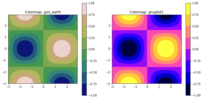
The default color scheme of Matplotlib contour and filled contour plots can be modified. A general way to modify the color scheme is to call Matplotlib’s plt.get_cmap() function that outputs a color map object. There are many different colormaps available to apply to contour plots. A complete list is available in the Matplotlib documentation (https://matplotlib.org). The colormap object is then passed to the ax.contourf() or ax.contour() method as a keyword argument.
mycmap = plt.get_cmap('gist_earth')
ax.contourf(X, Y, Z, cmap=mycmap)
The code section below produces two filled contour plots, contour plot has a different color map.
import matplotlib.pyplot as plt
import numpy as np
# if using a Jupyter notebook, include:
%matplotlib inline

x = np.arange(-3.0, 3.0, 0.1)
y = np.arange(-3.0, 3.0, 0.1)

X, Y = np.meshgrid(x, y)

Z = np.sin(X)*np.cos(Y)

fig, (ax1, ax2) = plt.subplots(1, 2, figsize=(12,6))

mycmap1 = plt.get_cmap('gist_earth')
ax1.set_aspect('equal')
ax1.set_title('Colormap: gist_earth')
cf1 = ax1.contourf(X,Y,Z, cmap=mycmap1)

fig.colorbar(cf1, ax=ax1)

mycmap2 = plt.get_cmap('gnuplot2')
ax2.set_aspect('equal')
ax2.set_title('Colormap: gnuplot2')
cf2 = ax2.contourf(X,Y,Z, cmap=mycmap2)

fig.colorbar(cf2, ax=ax2)

plt.show()
