30. Adding a palette to an axis#
Download add_palette.ipynb from the week5 folder
30.1. Introduction#
Plotting images with complicated palettes is a pain. If you have a palette you like, and would like to use over and over again, you can wrap that palette in a function, as shown below.
from pathlib import Path
from matplotlib import pyplot as plt
from matplotlib.colors import Normalize
import rioxarray
30.2. Get the blue band#
data_dir = Path().home() / 'repos/a301/satdata/landsat'
tif_file = data_dir.glob("**/*B02.tif")
tif_file = list(tif_file)[0]
has_file = tif_file.exists()
print(f"{tif_file=}")
if not has_file:
    raise IOError(f"can't find {tif_file}")
hls_blue = rioxarray.open_rasterio(tif_file,masked=True)
hls_blue=hls_blue.squeeze()
hls_blue = hls_blue*hls_blue.scale_factor
tif_file=PosixPath('/Users/phil/repos/a301/satdata/landsat/vancouver/HLS.L30.T10UDV.2015165T190019.v2.0.B02.tif')
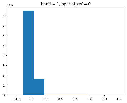
30.3. Step 1 Histogram the image#
The histogram shows that most of the pixels are very dark, but there are a few bright clouds. We’re going to see very little information from this raw image with a default palette
hls_blue.plot.hist();
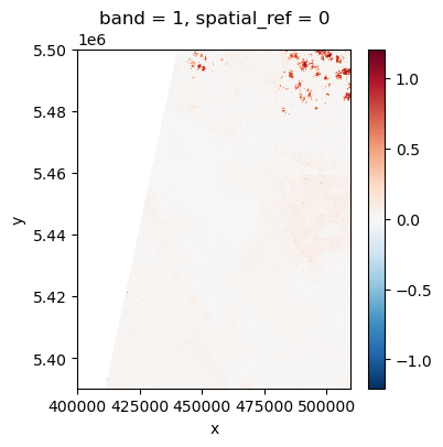
30.4. Step 2: Make a default plot#
As expected, not good
fig, ax = plt.subplots(1, 1, figsize=(4, 4))
hls_blue.plot.imshow(ax=ax);
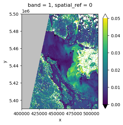
30.5. Step 3: Normalized palette#
Create a normalized palette with values for the over and under colors and minimum and maximum values. This looks better.
vmin, vmax = 0., 0.05
the_norm = Normalize(vmin=vmin, vmax=vmax, clip=False)
palette = "viridis"
pal = plt.get_cmap(palette)
pal.set_bad("0.75")  # 75% grey for out-of-map cells
pal.set_over("w")  # color cells > vmax white
pal.set_under("k")  # color cells < vmin black
fig, ax = plt.subplots(1, 1, figsize=(4, 4))
hls_blue.plot.imshow(ax=ax, cmap=pal, norm=the_norm, origin="upper",extend = "both");
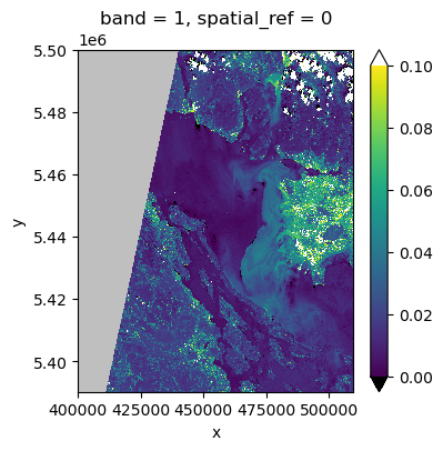
30.6. Step 5: create a function#
But that’s a lot of work to make one picture. We can create an importable function called make_pal to encapsulate some of that.
def make_pal(vmin = None, vmax = None, palette = "viridis"):
    the_norm = Normalize(vmin=vmin, vmax=vmax, clip=False)
    pal = plt.get_cmap(palette)
    pal.set_bad("0.75")  # 75% grey for out-of-map cells
    pal.set_over("w")  # color cells > vmax white
    pal.set_under("k")  # color cells < vmin black
    return the_norm, pal

vmin, vmax = 0,0.1
the_norm, pal = make_pal(vmin, vmax)
fig, ax = plt.subplots(1, 1, figsize=(4, 4))
hls_blue.plot.imshow(ax=ax, cmap=pal, norm=the_norm, origin="upper",extend = "both");
30.7. Step 6: pass a dictionary using keyword expansion#
If we don’t like typing all those parameters into imshow, we could return
a dictionary and use it as below. The problem with this is that a new
user reading the code would have trouble figuring out what imshow actually needs for arguments,
because they wouldn’t see the code for make_pal, which would be imported from
a library.
def make_pal(ax,vmin = None, vmax = None, palette = "viridis"):
    the_norm = Normalize(vmin=vmin, vmax=vmax, clip=False)
    pal = plt.get_cmap(palette)
    pal.set_bad("0.75")  # 75% grey for out-of-map cells
    pal.set_over("w")  # color cells > vmax white
    pal.set_under("k")  # color cells < vmin black
    out_dict=dict(ax=ax,cmap=pal,norm=the_norm, origin="upper",
                  extend = "both")
    return out_dict

vmin, vmax = 0,0.1
fig, ax = plt.subplots(1, 1, figsize=(4, 4))
pal_dict = make_pal(ax,vmin, vmax)
#
# pretty simple
#
hls_blue.plot.imshow(**pal_dict);