40. Making color composite (“false color”) images#
40.1. Definitions: “24 bit color”, “true color”, “false color”#
Up to now we have been showing images using “8 bit color”, where pixel values are scaled from 0 to 255 and mapped to a palette with 256 different color values. The finished images that we will create towards the end of this notebook will instead have three layers to drive the red, green and blue levels of a computer/phone display. Each layer is an 8 bit unsigned integer that can take on \(2^8\) = 256 different levels. The whole image therefore takes \(3 \times 8\) = 24 bits per pixel, or “24 bit color”. When the red, green and blue bands are mapped to red, green and blue levels, the image is called “true color”. When other bands are mapped to display red, green and blue levels the image is called “false color”
40.2. Introduction#
Color composite images are a useful tool in remote sensing. They map arbitrary image wavelengths to the primary colors (for example landsat 8 band 5 (near-ir, 0.86 microns) mapped to red, landsat 8 band 4 (red, 0.66 microns) mapped to blue, and landsat band 3 (green, 0.55 microns) mapped to blue). In such a “color ir” image, vegetation, which is very bright in the near-ir, will show up as bright red, while water, different types of soils, etc. will show up as other colors. Here are some examples of popular band combinations for the landsat 8 bands
Something to note: one point of confusion is that the red, green and blue bands for landsat 8 are label band 4, band 3 and band 2 respectively, so remember that an rgb landsat image is desiginated by the band combination 432.
In this notebook we will generate a “color ir” image from bands 5, 4, 3 using a clipped vancouver scene, reprocessing them into a false color composite. The final format needs to follow the “portable network graphics (png) truecolor” standard:
the pixels in each band have values between 0-255 (i.e. one 8 bit byte)
the bands are packed into 3 dimensional array with shape [3,nrows,ncols]
the band order needs to be red=index 0, blue=index 1 and green=index 2
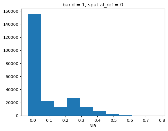
We will also need to rewrite the images so that each band makes use of all the available 255 levels. This means we need to change the data values significantly, for the images below the reflectivities in bands 3 and 4 are below 0.2, which means if we just converted them to 0-255 we’d only be using 20% of the 255 levels. Fixing this problem by redistributing the data is called “stretching”. Below we’ll show how to do a “histogram stretch”. Since the underlying data is changed in the image, false color composites are a qualitative, rather than a quantitative tool.
40.2.1. Running this notebook#
Download the
false_color.ipynbnotebook from week7 in our gdrive folderDownload the folder
downloads/vancouver/week7containing the clipped tif files and place it in~/repos/a301/satdata/landsat/vancouver
40.3. Read in the clipped image#
We use numpy.squeeze() to squeeze out the band dimension, so arrays with 3 dimensions (1,nrows,ncols) become 2 dimensional with shape (nrows,ncols)
import xarray
import rioxarray
from pathlib import Path
from matplotlib import pyplot as plt
import numpy as np
import seaborn as sns
from skimage import exposure, img_as_ubyte
from IPython.display import Image
from a301_lib import make_pal
data_dir = Path().home() / 'repos/a301/satdata/landsat/vancouver'
blue = list(data_dir.glob('**/*Blue*tif'))[0]
red = list(data_dir.glob('**/*Red*tif'))[0]
green = list(data_dir.glob('**/*Green*tif'))[0]
nir =  list(data_dir.glob('**/*NIR*tif'))[0]
band_dict = dict(zip(('red','green','nir','blue'),(red,green,nir,blue)))
xarray_dict={}
for key,filename in band_dict.items():
    print(key)
    xarray_dict[key] = rioxarray.open_rasterio(filename,mask_and_scale=True);
    xarray_dict[key] = xarray_dict[key].squeeze()
red
green
nir
blue
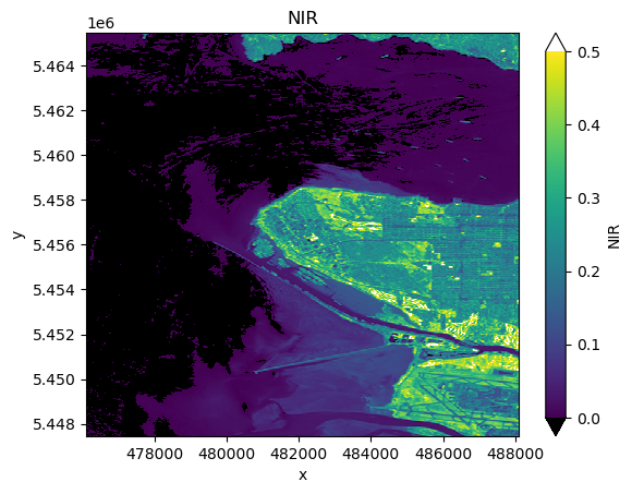
xarray_dict['nir'].plot.hist();
vmin = 0.0
vmax = 0.5
pal_dict = make_pal(vmin=vmin,vmax=vmax)
fig, ax = plt.subplots(1,1)
var = 'nir'
xarray_dict[var].plot.imshow(ax=ax,
                    norm = pal_dict['norm'],
                    cmap = pal_dict['cmap'],
                    extend = "both")
ax.set(title=f"{xarray_dict[var].long_name}");
40.3.1. Give the bands shorter names#
Makes it easier to type
b2, b3, b4, b5 = xarray_dict['blue'],xarray_dict['green'], xarray_dict['red'], xarray_dict['nir']
40.4. Plotting joint histograms#
Below we plot some joint histograms of using seaborn.jointplot. This is a very powerful way to look for correlations between datasets, showing the both the 2-dimensional histogram (darker colors mean more pixels in the bin) and the band histograms.
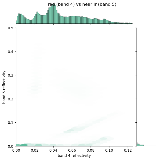
The plots show that bands 3 and 4 (green and red) have reflectivities below about 20%, while band 5 (near-ir) as expected is much brighter, with a few reflectivites up to about 50%. The images are much more interesting if every band has reflectivities ranging between 0 and 1. When we plot using a color palette and 0-255 color values (8 bit color) we use Normalize with vmin and vmax to stretch the colors between a minimum and maximum and ignore low and high values. This is called a “linear stretch”. There is a more sophisticated way to assign color levels by manipulating the probability density distributions of the pixels, as described in the next section.
fig = sns.jointplot(
    x=b3.data.ravel(),
    y=b4.data.ravel(),
    xlim=(0, 0.125),
    ylim=(0.0, 0.125),
    kind="hex",
    color="#4CB391",
    gridsize=100
)
fig.fig.suptitle("green (band 3) vs red (band 4)");
axes = fig.fig.get_axes()
axes[0].set(xlabel = "band 3 reflectivity",
            ylabel = "band 4 reflectivity");
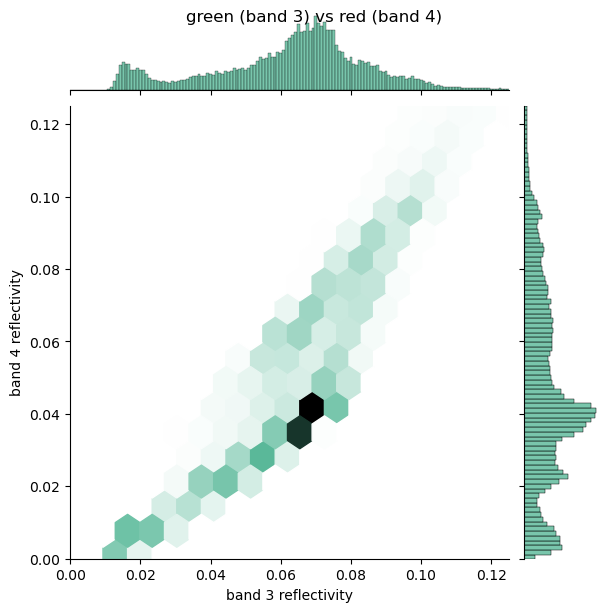
Note that the plot below looks funny because there are many water pixels with low reflectivity. We’ll mask these out in the next notebook
fig = sns.jointplot(
    x=b4.data.ravel(),
    y=b5.data.ravel(),
    kind="hex",
    xlim=(0, 0.125),
    ylim=(0.0, 0.5),
    color="#4CB391",
    gridsize=100
)
fig.fig.suptitle("red (band 4) vs near ir (band 5)");
axes = fig.fig.get_axes()
axes[0].set(xlabel = "band 4 reflectivity",
            ylabel = "band 5 reflectivity");
40.5. Histogram equalization#
Histogram equalization is a technique for changing the image data while preserving part of its character as represented in its histogram. It uses the cumulative distribution which is defined as the cumulative sum of the histogram of the image. That is, if the nuber of pixels with levels between \(l^\prime\) and \(l^\prime + dl^\prime\) is \(n(l^\prime)\,dl^\prime\), then the cumulative distribution \(N(l)\) is given by:
In words, \(N(l)\) is the number of pixels with level less than \(l\)
The idea is to change (“stretch”) the histogram bins so that \(N(l) \approx\) constant for values of \(l\) that contain most of the pixels.
Here’s the cumulative distribution for the pdf for a gaussian distribution (bell curve):
x = np.random.randn(100000) # generate samples from normal distribution (discrete data)
fig, ax = plt.subplots(1,1)
#
# cumulative distribution N(l)
#
ax.hist(x,bins=200,density=True, cumulative=True,label="cumulative")
#
# probability density n(l)
#
ax.hist(x,bins=200,density=True,label = "pdf")
ax.set(title="gaussian pdf n(l) and cumulative distribution N(l)",
       xlabel="pixel level",
       ylabel = "n(l) (#pixels/(bin width)) and N(l) (#pixels with level < l)")
ax.legend(loc="best");
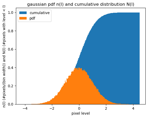
For this fake image, almost all the values are between -2 and 2, but the whole data range goes between -4 - 4. If we use the blue curve to map xaxis values between -2 and 2 to y axis values between 0.1-0.99, we are “stretching” the data to fill a range that is proportial to how many of these values actually occur in the image. Values between -4 and -4 are still represented, but they only get levels between about 1% of the levels after the stetch, instead of 25%.
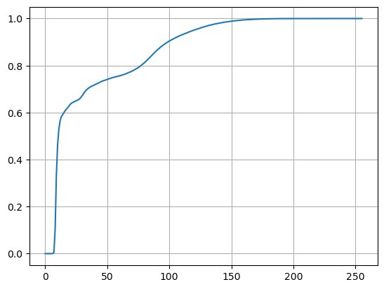
40.5.1. Here’s the cumulative distribution for band 5#
If we stretch the band 5 values to this cumulative distribution, 50% of the data range (0-125) is going to get essentially 100% of the levels between 0-1.
from skimage import exposure
#
# want 256 levels from 0-255
#
bins=256
img_cdf, bins = exposure.cumulative_distribution(b5.data.ravel(), bins)
plt.plot(img_cdf)
plt.grid(True);
40.5.2. Stretching step 1: stretch the data in each band and save to a dictionary with the band name as key#
To do the histogram stretch we’ll use the scikit-image equalization module. It uses our boolean mask to ignore np.nan values when it calculates the distribution.
stretched_dict = dict()
keys = ['b2','b3','b4','b5']
images = [b2, b3, b4, b5]
for key, image in zip(keys,images):
    stretched_dict[key] = exposure.equalize_hist(image.data)
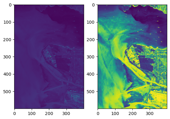
40.5.3. Before and after stretching#
Pretty dramatic difference
fig, (ax1, ax2) = plt.subplots(1,2)
ax1.imshow(b3);
ax2.imshow(stretched_dict['b3']);
40.5.4. Stretching step 2: check the stretched histograms#
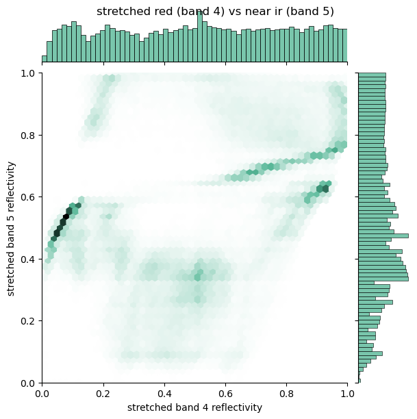
Redo the histogram plots to show the stretched distributions. Note that they still contain information about the correlation between bands, but the distributions are much broader than their unstretched versions. Also note that in each of the joint plot there are clusters of pixels that share similar values in the two bands. These clusters correspond to similar surface types (water, grass fields, golf courses, concrete pavement etc.)
fig = sns.jointplot(
    x=stretched_dict['b3'].ravel(),
    y=stretched_dict['b4'].ravel(),
    xlim=(0, 1),
    ylim=(0.0, 1),
    kind="hex",
    color="#4CB391"
)
fig.fig.suptitle("stretched green (band 3) vs red (band 4)");
axes = fig.fig.get_axes()
axes[0].set(xlabel = "stretched band 3 reflectivity",
            ylabel = "stretched band 4 reflectivity");
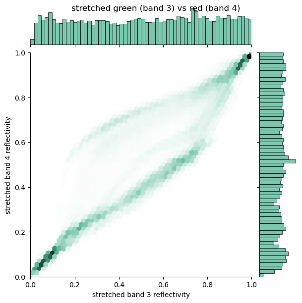
fig = sns.jointplot(
    x=stretched_dict['b4'].ravel(),
    y=stretched_dict['b5'].ravel(),
    xlim=(0, 1),
    ylim=(0.0, 1),
    kind="hex",
    color="#4CB391"
)
fig.fig.suptitle("stretched red (band 4) vs near ir (band 5)");
axes = fig.fig.get_axes()
axes[0].set(xlabel = "stretched band 4 reflectivity",
            ylabel = "stretched band 5 reflectivity");
40.6. Write the false color image into 3-dimensional array called “band_values”#
We need to fill a new array of shape [3,nrows,ncols] and dtype=unsigned integer (byte)
with the
bands in the correct order – red, blue, green. The cell below does this
using the img_as_ubyte function, which scales and converts the floating point reflectivities to “unsigned bytes”
which are postive 8 bit numbers with range 0-255. The
output array needs to have the same number of rows and columns as the original image. I’ll use
b3.shape to get those.
nrows, ncols = b3.shape
band_values = np.empty([3, nrows, ncols], dtype=np.uint8)
for index, key in enumerate(['b5', 'b4', 'b3']):
    stretched = stretched_dict[key]
    band_values[index, :, :] = img_as_ubyte(stretched)
40.6.1. Note that we’ve lost our missing values#
There’s no way to write an np.nan as a missing value in a datatype that can only take on values between 0 and 255, so all missing values have been converted to 0
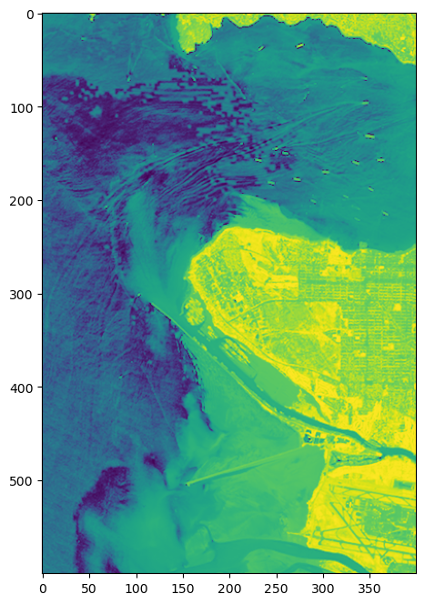
40.6.2. Stretched band 5 (nir)#
fig, ax = plt.subplots(1,1,figsize=(12,8))
ax.imshow(band_values[0, :, :]);
40.6.3. Create the dataArray#
Now that I have 3 bands scaled from 0-255, I can write them out as a png file, with new tags. Recall from the Zooming an image that I need to supply the array, dimensions, coordinates and attributes.
For the coordinate dictionary, I can borrow the ‘x’ and ‘y’ coordinates from band 3.
dims = ('band','y','x')
coords={'band':('band',[5,4,3]),
        'x': ('x',b3.x.data),
        'y': ('y',b3.y.data)}
40.6.4. Add attributes#
I’ll keep some of the old attributes from the original bands_543 dataset, and
add two new ones: history and landsat_rgb_bands.
band_names=['B05','B04','B03']
keep_attrs = ['cloud_cover','date','day','target_lat','target_lon']
all_attrs = xarray_dict['red'].attrs
attr_dict = {key: value for key, value in all_attrs.items() if key in keep_attrs}
attr_dict['history']="written by false_color.md"
attr_dict["landsat_rgb_bands"] = band_names
40.6.5. Create the falsecolor dataArray#
Just copy this from the zoom_landsat notebook
false_color=xarray.DataArray(band_values,coords=coords,
                            dims=dims,
                            attrs=attr_dict)
false_color.rio.write_crs(b3.rio.crs, inplace=True)
false_color.rio.write_transform(b3.rio.transform(), inplace=True);
false_color
<xarray.DataArray (band: 3, y: 600, x: 400)> Size: 720kB
array([[[119, 121, 121, ..., 216, 232, 232],
[116, 122, 123, ..., 230, 234, 234],
[119, 122, 122, ..., 217, 220, 228],
...,
[108, 95, 101, ..., 191, 188, 193],
[113, 102, 95, ..., 196, 195, 202],
[116, 110, 99, ..., 218, 214, 214]],
[[ 15, 16, 17, ..., 205, 173, 229],
[ 15, 17, 19, ..., 173, 165, 202],
[ 16, 19, 19, ..., 217, 195, 184],
...,
[135, 120, 126, ..., 237, 224, 241],
[138, 132, 122, ..., 251, 250, 249],
[135, 136, 132, ..., 255, 255, 254]],
[[ 18, 19, 20, ..., 195, 132, 216],
[ 19, 21, 21, ..., 109, 126, 173],
[ 20, 21, 21, ..., 208, 159, 146],
...,
[172, 142, 149, ..., 223, 216, 236],
[176, 161, 143, ..., 252, 251, 249],
[172, 170, 162, ..., 255, 255, 254]]],
shape=(3, 600, 400), dtype=uint8)
Coordinates:
* band (band) int64 24B 5 4 3
* x (x) float64 3kB 4.761e+05 4.761e+05 ... 4.881e+05 4.881e+05
* y (y) float64 5kB 5.465e+06 5.465e+06 ... 5.448e+06 5.447e+06
spatial_ref int64 8B 0
Attributes:
history: written by false_color.md
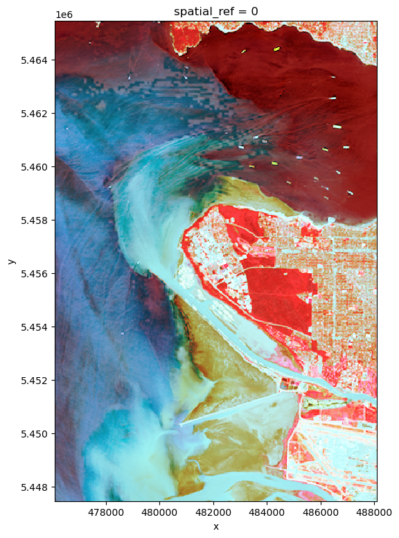
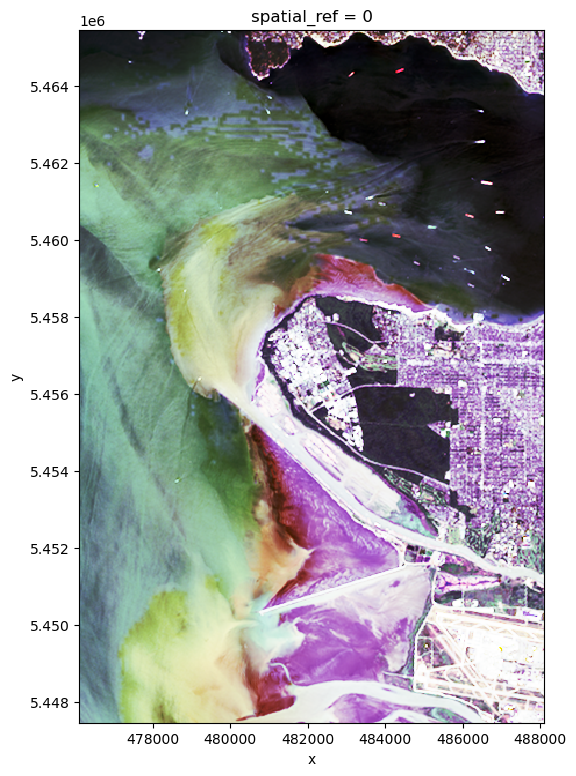
landsat_rgb_bands: ['B05', 'B04', 'B03']The final image – the imshow function interprets any array with shape [3, nrows, ncols] as a false color image and presents it with rgb colors.
40.6.5.1. False color bands 5,4,3#
false_color.plot.imshow(figsize=(6,9));
40.6.6. Save as a png file#
Now that we have a standard 24 bit color 3 channel array we can create either a png or a jpg file that can be viewed with a browser.
If the filename ends in png, rioxarray will save it in the standard png format.
png_filename = data_dir / "vancouver_543.png"
false_color.rio.to_raster(png_filename)
40.6.7. Read it back in to check#
Here’s the finished product – read back in from the png file
Image(filename=png_filename,width=300)
40.7. Repeat with the red, green, blue#
Try a true color image, note that simple stretching doesn’t really work to make photo-realistic picture
#
# just repeat replacing nir b5 with blue b2
#
nrows, ncols = b3.shape
band_values = np.empty([3, nrows, ncols], dtype=np.uint8)
for index, key in enumerate(['b4', 'b3', 'b2']):
    stretched = stretched_dict[key]
    band_values[index, :, :] = img_as_ubyte(stretched)
true_color=xarray.DataArray(band_values,coords=coords,
                            dims=dims,
                            attrs=attr_dict)
true_color.rio.write_crs(b3.rio.crs, inplace=True)
true_color.rio.write_transform(b3.rio.transform(), inplace=True);
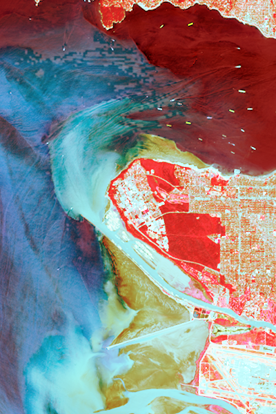
40.7.1. bands 4,3,2 – looking strange#
true_color.plot.imshow(figsize=(6,9));
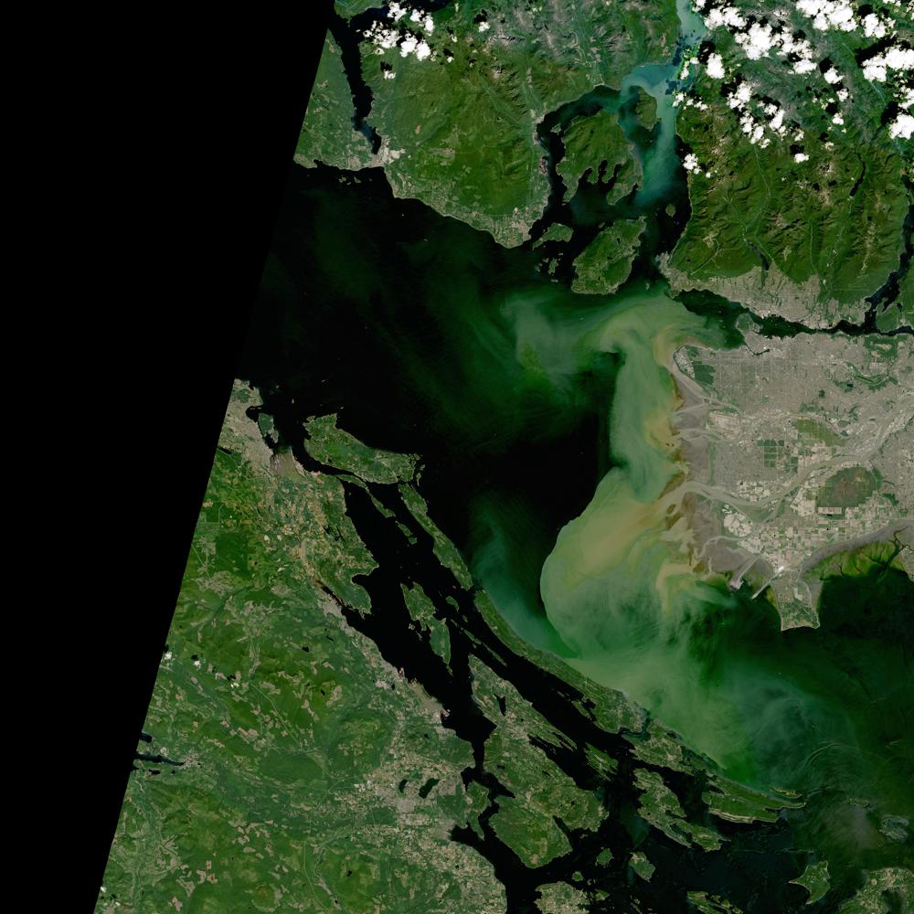
40.7.2. compare with the Nasa browse image#
Question: what’s the difference between DataArray.plot.imshow and IPython.display.Image
browse_jpg = list(data_dir.glob("**/*vancouver*jpg"))[0]
Image(browse_jpg,width=300)
40.8. Summary#
False color images have advantages and disadvantages. They make it easy to see subtle differences between image regions, but the cost is that the stretched histograms now don’t connect directly to the original radiances.
40.9. Assignment 5 part 1: create a false color image for your scene#
Due next Friday
Write a function that takes 3 tif files and returns a rioxarray false color image. Use it to make a band 5,4,3 false color png file of your scene